Saturday, June 13, 2020

Carlson's Guide to Landscape Painting

Notes on John F. Carlson's Guide to Landscape Painting


When I first got a copy of this book, I managed to read about half of it.
I knew Carlson was offering up some good advice, but older books like this can be tough to get through. (Somewhat antiquated language, written by someone who's first skill is not writing, etc.) A few months ago, I got determined to read the whole thing from front to back and take notes as I did so. And I did so.

This book originally came out in 1928 as Elementary Principles of Landscape Paintings. My copy (pictured above) is a reprint from the 1950s. Nowadays there is a very affordable reprint available for around $14 in paperback.

Some strange things about my edition of this book:
- an odd choice of work to put on the cover. Far from one of Carlson's best, and it appears to be a watercolor (!) to my eyes. The book is about oil painting, btw. All understandable given Carlson would have had no say in this later reprint as he passed in 1947.

- There seem to be a similarly poor representation (to my eyes and tastes) of the quality of Carlson's work in the inner images as well. Again, he may not have had a say in that (or all of them). Also, there is a grand total of ONE color reproduction inside. Smack in the middle. What was the point of that? At least give us 6 or 8... Anywho... Carlson could churn out some amazing paintings and I have decided to sprinkle a few of those in this post to delight your weary eyes.


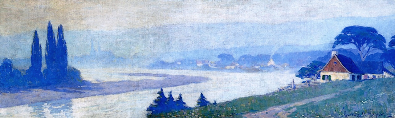
Morning in the Forest


As I read, I wrote down passages that clicked with me.
Below are some of the best ones, with the name of the chapter in which they appear.
(I also included some of my own thoughts and reactions here and there in blue.)


1. How to Approach Painting


"... the camera does not have an idea about the objects reflected upon its lens. It does not 'feel' anything..."

2. The Mechanics of Painting

"Do not be afraid to spoil what you have, so long as you know why you are making a change."

– This resonates with me. Some large area in a painting seems.... wrong. I think and think about it, putting off what seems like a risk, until I embark on the change and almost always it was the right thing to do.

3. Angles and Consequent Values

"In most instances when the beginner finds the color of anything 'impossible,' the fault lies not in the color, but in the faulty value or weight of the mass."

– Another way of saying that value is predominant over color. Or that if you can't get the color right, get the value right.

4. Design

"Nature is seldom perfect in design."

5. Light

"No one can tell another person exactly what the color of anything is, because each of us has a variously differing 'color sense.'"

"It might almost be given as a 'recipe' that the smaller the dark mass presented against a light, the lighter and fainter becomes that dark."

– Especially visible as tree branches get thinner and thinner near the top. More light "wraps" around them and their value seems to lighten.

"... there is no such thing as flat tone in all outdoor nature – it is changing toward or from the light."


Sylvan Labyrinth


6. Aerial Perspective

"The sky is the key to the landscape"


8. Color

"... the student, by a very slight degree of self-analysis, can select his gamuts and harmonies, as well as his constructive lines of color, rather than merely stupidly taking things as they come in nature. We must not train our eyes to copy tone for tone, but think of the bearing of such colors and harmonies upon the main idea of our picture."
"Reserve us strength; overstatement is weakness."


– The downside of this can be seen in paintings where all the colors of the spectrum and a full value scale are present, but the painting doesn't work. Restraint.

9. Trees

"The painting of tress is best accomplished by much drawing of trees."

"... do not think that because a landscape is "real" that it is a work of art. A true picture is one in which so-called natural elements are made to function as an idea."

11. Composition

" The choosing of  expressive limitation is not child's play – it is mature choice."

– I relate this to expressive strategies like working with a limited palette, or reduced value scale. Those kind of limitations in the service of your painting can be what makes it work.

"A work of art in paint should be beautiful and expressive as abstract color and form and should not interest us necessarily in any "story" outside of itself..."

– A representative work of art should also work on an abstract level.

"Too much reality in a picture is always a disappointment to the imaginative soul. We love suggestion and not hard facts. A picture should be music in form and color, with the subject-matter the vehicle."

"Analyze your impression in order to approach expression..."


City Twilight


13. The Extraordinary and Bizarre.

"... homely objects and effects are made sublime in their transmutation, in the passage from the artist's brain to the canvas."

14. Painting from Memory

"... memory exaggerates the essentials..."

– This is why the exercise of memory painting, or sketching a scene that moved you later on will often get you just the key elements, and not the distracting minutiae of needless details.


Those are some of the key points to my mind. I took a lot more notes than this and distilled them to the essential.


Friday, May 1, 2020

Canadian Artists, Part II – Marc-Aurèle de Foy Suzor-Coté

Marc-Aurèle de Foy Suzor-Coté

(1869–1937)

His name is quite a mouthful.

Monsieur Suzor-Coté – like M. Gagnon from my last post – was born in the province of Quebec. From the town of Arthabaska (modern-day Victoriaville), he began his artistic career working on interior decorations for churches. Later, he studied in Paris (with Léon Bonnat) and returned to Canada in 1908 and maintained a studio in Montreal. where he sculpted as well as painted.

(Biography on National Gallery of Canada site.)


Mauve and Gold


Levée de Lun


He drew influences from the artists Henri HarpigniesFrits Thaulow and Jean-François Millet. It is said that he put paint down very thickly with a brush and then flattened it with a palette knife to get the effect he wanted. Even from online images, some of his paintings look to have very heavy paint application.

His color handling and the texture of his work really knock me out. I would love to see a work of his in person.


the man himself – looking dapper


Evening


After the Breakup


Sunset Arthabaska


Paysage


Friday, April 24, 2020

Canadian Artists, Part I – Clarence Gagnon

Time to share my enthusiasm for some artists that have recently come to my attention.

I am a fan of members of the famous Canadian Group of Seven painters, and they led me to other great Canadian artists. Specifically two, one of which I will show off in this post.

Clarence Gagnon
1881–1942


French Canadian painter & engraver


Brittany Goose Girl


Baie Saint-Paul
c. 1914-1917


Clarence Gagnon was born in rural Quebec and studied art first in Montreal. He later also studied in Paris and returned to Europe many times. He lived most of his life in Baie-Saint-Paul, not far from Quebec City, downriver along the St. Lawrence.

Even though he lived and worked in Europe for long stretches, his subject remained almost exclusively his beloved Charlevoix region of Eastern Quebec.


En Novembre


Gagnon_Le Ruisseau, Baie-Saint-Paul


I just love his work. He had a great color sense and a wonderful looseness in his painting technique. All that, and then I saw his engravings – whoa. They are absolutely stunning and full of mood.

The National Gallery of Canada has a nice biography of him and a bunch of work online.


Gagnon_Jardins du Grand Séminaire, Montréal


Overlooking the Vallée du Gouffre, Charlevoix


Summer Day, Les Andelys, Normandy


Summer Scene, Baie-Saint-Paul


A little analysis of the above painting:


– wide, panoramic format (ratio of 1:3.3)
– cool color scheme of blues overall, with the house being the only overtly warm area
– groups of blue trees form 3 points of "rest," with the eye tending to move between them
– most saturated area of color is foreground center group of trees, also a very high contrast spot from trees to river behind


Next time: Marc-Aurèle de Foy Suzor-Coté

Tuesday, April 21, 2020

Online resources for artists and art-lovers in this cloistered age

Well, the world sure has changed since I last posted here in.... November?

Last week I did an Instagram takeover of the Lillstreet Drawing & Painting account:
In preparation for that, I compiled a list of new and ongoing worthwhile art-related online resources. Some specifically created for this cloistered age we live in. I never ended up posting them and so they are now a blog post.
Enjoy.


Free excerpts of Streamline art videos on FB:
They keep adding more and they are not small excerpts. More like 1.5–2 hours long.
These videos are mostly quite expensive to purchase and so this is a great thing. Lots to be learned here.

Philip Mould’s Art in Isolation videos on IG:
Mr. Mould is a gallery owner and one of the hosts of Fake or Fortune on the BBC. In these daily (weekdays) videos, he shows you around his home in the English countryside and goes into detail about pieces in his art collection.


Andrei Taraschuk's Twitter art bots:
Andrei Taraschuk creates art bots on Twitter. They are code that pull images off the internet and posts them to Twitter. They feed my eyes and brain with tons of beautiful images every day. It's one of the major reasons (for me) to even get on Twitter:


Online auction catalogs:
The link goes to  “Art Impressionniste et Moderne” at Sotheby's but there are a TON of these online and a great resource to browse/search for inspiring images. You can look through catalogs of current and past auctions.
Of course, there are plenty of other auction houses with great images online. Like Waddington's in Canada:


Waldy and Bendy's Adventures in Art:
https://www.thetimes.co.uk/article/waldy-and-bendys-adventures-in-art-25w56nkkm
Waldemar "Waldy" Januszczak (left) and Bendor “Bendy” Grosvenor host this art podcast. Well, not a normal podcast, as you listen in a browser window on the Times site. The plus is, that when an artwork is referred to, the image shows up. In that respect, far better than an audio-only podcast on the visual arts. Both of these gentlemen have hosted art programs I have enjoyed.
Just the other day, Mr. Grosvenor started a new podcast, Art History at Bedtime. I have as yet to listen to it.
https://www.stitcher.com/podcast/art-history-at-bedtime


Just the other day, I saw an article about the best museum web sites to while away your time on. The author wanted to make a list of ten (I think), but only two (!) made her cut. (I can't seem to find the original article right now.)
Anyway, the 2 were The Rijksmuseum and The Met. I have spent a lot of time on the Met's site. Not so much at The Rijksmusem's site.
You be the judge:
https://www.rijksmuseum.nl/
https://www.metmuseum.org/

Line of Action drawing reference tool:
Figure, animal, landscape reference site. You can just draw from something you like, or do a timed session to practice starts. Learning to start strongly and with a plan is key.


ARTFIXDaily email sign up:

Daily news compendium of art-doings. New exhibits, discoveries, etc. Some days ho-hum, other days quite fascinating.