Showing posts with label swatches. Show all posts

Friday, November 5, 2021

Comparing Blues

I got some new (to me) blue colors in oil recently, and I wanted to compare them with ones I have been regularly using.

• The top row is thick application with a palette knife and a "drawdown" to thinner at the bottom.

• The 2nd & 3rd rows are tints (tube blue + titanium white)

• 4th row is pure paint applied with a brush

• Bottom row is each blue with just enough white to bring the color out. Many blues (and other colors) are so dark straight out of the tube that they appear back, or colorless.

I tweaked this for color accuracy as much as possible, but it still lacks something compared to viewing in person


My conclusions? Hmmmm..... Well, they all have their uses and tendencies.

Straight out of the tube (no tinting):  Cerulean and Cobalt show the most pronounced color. Those two are lighter in value (without he addition of white) and my eye can register the hue better. This is Williamsburg "genuine" Cerulean (a more pricey color) my issue with it is that it's too pasty and thick. Which can be remedied, of course.

Cobalt seems like the least biased blue. Not strongly greenish or bluish to my eye. Williamsburg also makes a "Cobalt Deep" which I may try when this runs out. Some projects for making color wheels suggest Cobalt as a primary blue.

The Transparency of Ultramarine is nicely evident in the top drawdown. It's really the only one that evinces much transparency here.

I'd like to bring Prussian Blue back into some paintings again. The third row, far right tint is so much like what one sees in skies. Prussian seems like it occupies a spot in between Phthalo and Cobalt on the color wheel.

I think one could certainly use 3 out of these 5 in a painting to utilize the best features of each, depending on your painting's needs.
I am leaning toward using Ultramarine and Prussian for my warm and cool blues, respectively. I have been recently painting with a split-compliment palette using Ultramarine and Phthalo.




Friday, October 13, 2017

Two-color Painting Explorations | Confounding Expectations pt. 1

I recently taught a workshop called "Limited Palette Painting" at Evanston Art Center. Teaching a class (my first time) was a wonderful experience and I hope to do it again soon.

The goal of the class was trying to concern ourselves with pigment and paint in a deeper way by pushing a small number of colors to do as much as possible.

To work along with my students, I did a painting and mixing grid for Burnt Umber (Blick) and Indian Yellow (Liquitex Heavy Body) acrylic paint.  Working somewhat backwards (it's more ideal to do the mixing grid first), I first made a painting (using a black & white photograph for reference) using just these 2-colors:


I was rather surprised to find green tones appearing, especially in the upper right. (BTW, I tweaked the photos to look as they do in real life as much as possible. Some subtleties and colors will inevitably be off.)

I wasn't expecting any greens from 2 warm colors like these. Possibly if I had used raw umber (a cooler color), then maybe yes.

So to prove that I wasn't seeing things, I then made a matrix of possible mixtures of burnt umber and indian yellow and tinted them:


If you look at the center square and some of the ones around it, sure enough, it appears greenish.


And because I had originally started using Indian Yellow in oils, I made this comparison between the 2 versions of Indian Yellow I own in oil and acrylic:


It may be hard to see here, but in person, the Williamsburg oil version (left column) maintains a richer color as it gets tinted. Out of the tube it is more orangey and Liquitex  is more like yellow ochre.

The real point here is not so much why unexpected results can occur with pigments, but that you should explore and get to know what your pigments can do!

Pigment codes only tell part of the story, but it is important to be aware of them.

The acrylic colors I used were:
Blick Raw Umber PBr7
Liquitex Indian Yellow PY139

And my oil versions:
Williamsburg Burnt Umber PBr7
Williamsburg Indian Yellow PY83 (Diarylide Yellow)

Given that the Williamsburg Indian Yellow uses a different pigment, you would expect a slightly different result. (BTW, originally Indian Yellow supposedly came from feeding cows a diet of nothing but mango leaves and then collecting and drying their urine to get the pigment.)

Well, at least Burnt Umber is consistent. Or is it? I also have a tube of Michael Harding Burnt Umber which I haven't used yet, and it lists the pigment as PBr6. I would think that a common earth tone like that would be consistent.

Be aware.


Sunday, January 15, 2017

Limited palette & a swatch exercise

Lately I have been thinking a lot about painting with a limited palette, and the value of doing mixing exercises and making swatch sheets. Also, I have wanted to expand this blog from entries soley focusing on showing my own work, and more into musings on things I have learned as an artist (or are currently coming to grips with). This entry will get those balls rolling, so to speak.

Using an Amazon gift card I got for my birthday, I got Juliette Aristides' latest book Lessons in Classical Painting. It is really well done with a lot of practical information (I have spent time with her other books and they are all worth a look). It's one of those books that I wish had been around when I started painting.


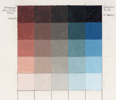
On page 115, she shows a sample exercise of mixing a grid of 2 colors (a warm and a cool) into each other to create a neutral, and then tinting the results. I have been working on a few paintings lately using transparent iron oxide red and prussian blue, so I decided to try it with those 2 colors.

Upper left below you see out-of-the-tube transparent iron oxide red and upper right you see prussian blue in the same state. Along the top row are the results of mixing them together, with the top middle square being as close to a neutral as I could get. Moving down are each of those mixes with progressively more and more white added to them.


I did the 5x5 grid (the book also shows a 9x9 one) on a piece of canvas paper.


There's a lot to be learned by doing this. When mixing, right away you get a feel for the tinting strengths and transparencies of the 2 colors. Not surprisingly, iron oxide red was more transparent and has far less tinting power than prussian blue. You also learn of the possibilities available with just these 2 colors. For example, there is possible a nice neutral very much like raw umber there right down the middle. Not really good greens for foliage, but the 2nd from the right column shows some blue-greens kind of like a slightly neutralized viridian green. This combo could certainly make some nice flesh colors and browns.
Obviously, one misses a true yellow but the variety possible with just 2 colors (the "right" 2 colors) can be pretty impressive.

I have the idea to next try a 3 color matrix with the 3 colors radiating out from a center neutral area. Stay tuned.