The Palette, and it's organization
This post probably contains far more thoughts on palette/color layout than most people would ever want. The key takeaway is that consistency in color arrangement on your palette can help with your painting efficiency. Find some way that you like to put out your colors, and stick to that (more or less).
And while I am in the world of oil paint in this post, color/palette organization applies just as well to acrylic and other media.
__________________________________
The word "palette" can mean a few different things in the context of art & painting.
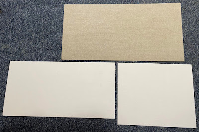
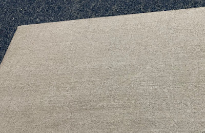
For the purposes of this blog entry, I refer to the surface you lay your colors out on. That might be a sheet of palette paper, a classic wooden palette, or a glass palette.
The other meanings for "palette" I most often encounter are these:
• the specific tube colors you lay out ~ As in saying I'm painting with the Zorn palette. That would mean you'd be using that specific set of colors/tubes to paint with.)
• the colors that appear in a picture ~ As in someone saying "I love the palette of greens and oranges in that painting." That might have little to do with the tube colors the artist actually employed, as greens and oranges are secondaries and could be mixed from primaries. Also, an artist will oftentimes put out a number of colors, but only really use a small subset of them in the painting.
__________________________________
This bit of writing delves into laying out your colors in an organized way and some different ways to do it. Being haphazard with how you lay out colors can only hinder the efficiency of your painting experience. If you put the same colors in the same places (for the most part), you can work a little faster when you need to grab a bit of a certain color for a mixture. It can become a little less of something to hunt for, and more a muscle memory type of thing.
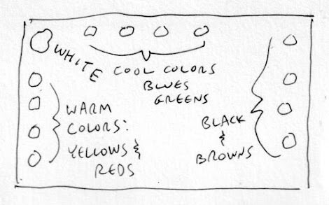
As you can see from some of the images from paintings I have included, these painters are using wooden palettes, which some folks still use. Their arrangement of pigments appears to be white (nearest the thumb) to yellows, reds, and on to darker colors as you move further out. Overall, an arrangement of light to dark. Also, white is frequently the most used pigment so it's often placed in a prominent place. And in the image below, you can see that a larger amount of white is put on the palette, which is common.

__________________________________


__________________________________


__________________________________
This blog/website lists the colors used by various artists, contemporary ones and masters of the past.