Wednesday, December 6, 2017

"White Ink"

My understanding is that white ink isn't really a true ink, as inks are always transparent and so white ink must have something added to it to make it opaque. Like acrylic binder.
With that out of the way:


I add light values to pen & ink drawings in a number of ways: colored pencil, gouache with a brush, and lately I have been trying some white gel pens.

I want a white I can use with a dip pen and brush, and so have been hunting for something that clicks with me. (Gouache out of a tube won't work well with a dip pen nib.)


The top "clouds" were applied with a No. 2 Robert Simmons Expression synthetic round brush.

The linear marks were made with one of my all-time favorite and most-used nibs, an Esterbrook 988:

Esterbrook 988 in a Koh-I-Noor holder.


My conclusion?
They all felt serviceable with brush and dip pen. I could make do with any of them if I had to. I think the Daler-Rowney flowed the best in the dip pen, And the cloud it produced has the most subtleties.


This drawing shows the effect of a dip pen putting in the light value lines:
 (I think the dark lines were a fine line marker)


Wednesday, October 18, 2017

Decoding Pigment Codes

limited palette painting demo in chromium oxide green and pyrrole red


     In the process of working on materials for my limited palette workshop at Evanston Art Center, I came across a number of interesting things in the world of colors and pigments and oil paints.

Now, I always assumed that a paint's pigment code (such as PB29 for Ultramarine Blue) was absolute. Not so much, really. It is pretty specific yes, but 2 paints from 2 different manufacturers can vary quite a bit even if they have the same pigment code. Also, 2 different-looking paint colors can be made from the same pigment, by varying the grind and including additives.


This whole labyrinth came to my attention when I realized that Cadmium Lemon and Cadmium Yellow Deep oil paints (both from Williamsburg) are each composed solely of PY35 pigment. Now, Cad Lemon is a lighter, cooler yellow and Cad Yellow Deep is more like an orangey yellow and darker in value. Pretty different while both obviously still being "yellow." How can they both be the same pigment? I emailed both Williamsburg and Gamblin these sort of questions and got helpful responses from both.

From Scott Bennett at Williamsburg/Golden:

"There are many examples of paint colors that have the same pigment ID number but exhibit different colors. Iron Oxides in general have a wide variety of colors due to little tweaks in trace elements and pigment size. Phthalo Blues and Quinacridone Reds can have the same number but with a color and a sub number indicating a variation. How the pigment is ground during paint making will change the color. PR 108,..the various Cadmium Reds, is similar but the differences have to do with the addition of selenium.

Differing hues of Cadmium reds, orange and yellow are made by increasing the percentage of selenium, zinc or sulfur during one stage of production. The range of cadmium pigments, yellow, orange, red are basically cadmium yellow (cadmium sulfide) with some selenium added in place of sulfur (cadmium selenide). Therefore cadmium sulfide can be made in various shades ranging from yellow, orange to red. Mineral pigment produced from cadmium sulphide when heated with selenium becomes red.

So it is not just one variable but a range of variables depending on the pigment. And the same pigment in different binders can look very different."


Another thing I found is that in researching colors, you really have to go to the manufacturer's site's to get accurate information on pigment content. It can seem handy to just look on the Blick site (or some other retailer), but they tend to just assume pigment content based on the name and I have found numerous errors.

Below, see Blick's pigment info on the left, and Michael Harding's on the R:


If you want to read info on specific pigments read up on:
The Color of Art Pigment Database


Friday, October 13, 2017

Two-color Painting Explorations | Confounding Expectations pt. 1

I recently taught a workshop called "Limited Palette Painting" at Evanston Art Center. Teaching a class (my first time) was a wonderful experience and I hope to do it again soon.

The goal of the class was trying to concern ourselves with pigment and paint in a deeper way by pushing a small number of colors to do as much as possible.

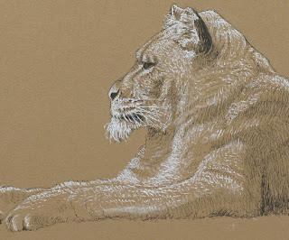
To work along with my students, I did a painting and mixing grid for Burnt Umber (Blick) and Indian Yellow (Liquitex Heavy Body) acrylic paint.  Working somewhat backwards (it's more ideal to do the mixing grid first), I first made a painting (using a black & white photograph for reference) using just these 2-colors:


I was rather surprised to find green tones appearing, especially in the upper right. (BTW, I tweaked the photos to look as they do in real life as much as possible. Some subtleties and colors will inevitably be off.)

I wasn't expecting any greens from 2 warm colors like these. Possibly if I had used raw umber (a cooler color), then maybe yes.

So to prove that I wasn't seeing things, I then made a matrix of possible mixtures of burnt umber and indian yellow and tinted them:


If you look at the center square and some of the ones around it, sure enough, it appears greenish.


And because I had originally started using Indian Yellow in oils, I made this comparison between the 2 versions of Indian Yellow I own in oil and acrylic:


It may be hard to see here, but in person, the Williamsburg oil version (left column) maintains a richer color as it gets tinted. Out of the tube it is more orangey and Liquitex  is more like yellow ochre.

The real point here is not so much why unexpected results can occur with pigments, but that you should explore and get to know what your pigments can do!

Pigment codes only tell part of the story, but it is important to be aware of them.

The acrylic colors I used were:
Blick Raw Umber PBr7
Liquitex Indian Yellow PY139

And my oil versions:
Williamsburg Burnt Umber PBr7
Williamsburg Indian Yellow PY83 (Diarylide Yellow)

Given that the Williamsburg Indian Yellow uses a different pigment, you would expect a slightly different result. (BTW, originally Indian Yellow supposedly came from feeding cows a diet of nothing but mango leaves and then collecting and drying their urine to get the pigment.)

Well, at least Burnt Umber is consistent. Or is it? I also have a tube of Michael Harding Burnt Umber which I haven't used yet, and it lists the pigment as PBr6. I would think that a common earth tone like that would be consistent.

Be aware.


Sunday, January 15, 2017

Limited palette & a swatch exercise

Lately I have been thinking a lot about painting with a limited palette, and the value of doing mixing exercises and making swatch sheets. Also, I have wanted to expand this blog from entries soley focusing on showing my own work, and more into musings on things I have learned as an artist (or are currently coming to grips with). This entry will get those balls rolling, so to speak.

Using an Amazon gift card I got for my birthday, I got Juliette Aristides' latest book Lessons in Classical Painting. It is really well done with a lot of practical information (I have spent time with her other books and they are all worth a look). It's one of those books that I wish had been around when I started painting.


On page 115, she shows a sample exercise of mixing a grid of 2 colors (a warm and a cool) into each other to create a neutral, and then tinting the results. I have been working on a few paintings lately using transparent iron oxide red and prussian blue, so I decided to try it with those 2 colors.

Upper left below you see out-of-the-tube transparent iron oxide red and upper right you see prussian blue in the same state. Along the top row are the results of mixing them together, with the top middle square being as close to a neutral as I could get. Moving down are each of those mixes with progressively more and more white added to them.


I did the 5x5 grid (the book also shows a 9x9 one) on a piece of canvas paper.


There's a lot to be learned by doing this. When mixing, right away you get a feel for the tinting strengths and transparencies of the 2 colors. Not surprisingly, iron oxide red was more transparent and has far less tinting power than prussian blue. You also learn of the possibilities available with just these 2 colors. For example, there is possible a nice neutral very much like raw umber there right down the middle. Not really good greens for foliage, but the 2nd from the right column shows some blue-greens kind of like a slightly neutralized viridian green. This combo could certainly make some nice flesh colors and browns.
Obviously, one misses a true yellow but the variety possible with just 2 colors (the "right" 2 colors) can be pretty impressive.

I have the idea to next try a 3 color matrix with the 3 colors radiating out from a center neutral area. Stay tuned.