I have decided to thoroughly read John Carlson's Carlson's Guide to Landscape Painting. When I first got the modern reprint version a number of years ago, I think I only got through about half of it. I now have a 1950s edition and intend to go through it in depth and take notes as I have for Birge Harrison's and Edgar Payne's books.


But prior to starting that task, I happened upon some passages that really clicked with me and relate beautifully to an exercise I am currently having my landscape painting students do with composition. We are sketching about 4 differently arranged compositions from a single photo. I want to push my students a little to look beyond working verbatim from photos.
Now let's hear direct from Mr. Carlson himself:
"Don’t paint “direct from nature” when all elements of organization and beauty or design are palpably absent.
The artist must look to nature for his inspiration, but must rearrange the elemental truths into an orderly sequence or progression of interests. By “sequence” is meant giving primary, secondary, or tertiary importance to such forms and color masses as are needed for an end and leaving all others out. In speaking of composition the use of the word “need” may sound enigmatic to the beginner. Let it be understood, then, that since nature is rarely perfect in design quality, the artist, in rearranging his “natural” elements upon the canvas, is creating a picture. This may involve moving objects to left or right, raising or lowering the horizon, slanting a mountain’s contour in a direction opposite to that of nature, enlarging or reducing various masses, strengthening or reducing certain lines, introducing minor elements such as stones, bushes, fences, flower-patches, etc., to give a desired line; “placing” clouds in a manner to emphasize their sweep and movement to coordinate with the other lines of his picture. He is really using nature and her forms, while he manipulates the natural truths to suit his artistic needs. Were this not so, the man who could slavishly imitate or copy nature as he saw her would be the greatest artist; but he never is.
No law or formula can be concocted by which good composition would always be assured. I can only suggest that the student experiment with charcoal and paper (with any given motif in mind) until he feels that one arrangement out of the several made embodies his idea better than all the others combined, and that he then try to decide why it is better."
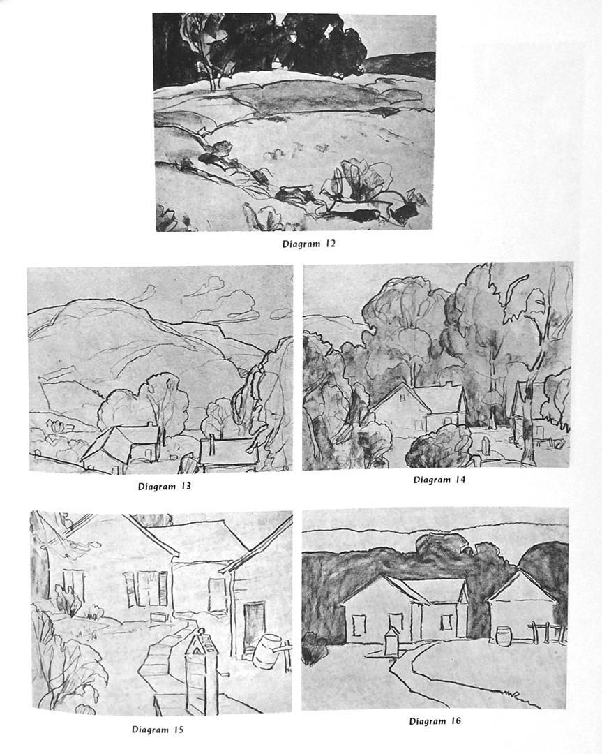
Carlson shows this with some reproduced sketches in his book:
And I do this myself as preparation work for many of my paintings:

These were sketched from one photo and I played with format (landscape, vertical, square, etc.) and the arrangement of elements). I personally like the look and quick results of working with white and dark pencils on toned paper.


