Using an Amazon gift card I got for my birthday, I got Juliette Aristides' latest book Lessons in Classical Painting. It is really well done with a lot of practical information (I have spent time with her other books and they are all worth a look). It's one of those books that I wish had been around when I started painting.
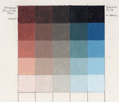
On page 115, she shows a sample exercise of mixing a grid of 2 colors (a warm and a cool) into each other to create a neutral, and then tinting the results. I have been working on a few paintings lately using transparent iron oxide red and prussian blue, so I decided to try it with those 2 colors.
Upper left below you see out-of-the-tube transparent iron oxide red and upper right you see prussian blue in the same state. Along the top row are the results of mixing them together, with the top middle square being as close to a neutral as I could get. Moving down are each of those mixes with progressively more and more white added to them.
I did the 5x5 grid (the book also shows a 9x9 one) on a piece of canvas paper.
There's a lot to be learned by doing this. When mixing, right away you get a feel for the tinting strengths and transparencies of the 2 colors. Not surprisingly, iron oxide red was more transparent and has far less tinting power than prussian blue. You also learn of the possibilities available with just these 2 colors. For example, there is possible a nice neutral very much like raw umber there right down the middle. Not really good greens for foliage, but the 2nd from the right column shows some blue-greens kind of like a slightly neutralized viridian green. This combo could certainly make some nice flesh colors and browns.
Obviously, one misses a true yellow but the variety possible with just 2 colors (the "right" 2 colors) can be pretty impressive.
I have the idea to next try a 3 color matrix with the 3 colors radiating out from a center neutral area. Stay tuned.


As a non-painter, I found this so interesting. It never occurred to me that preparation such as this might go into choosing a painting's color palette but it makes so much sense. Thanks for sharing.
ReplyDelete